Estonian Academy of Arts
Visit Viljandi
Virumaa Rannakalurite Ühing
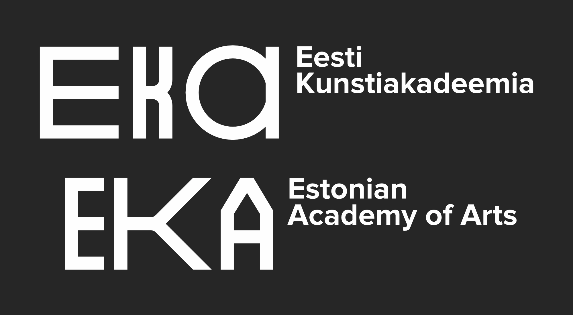
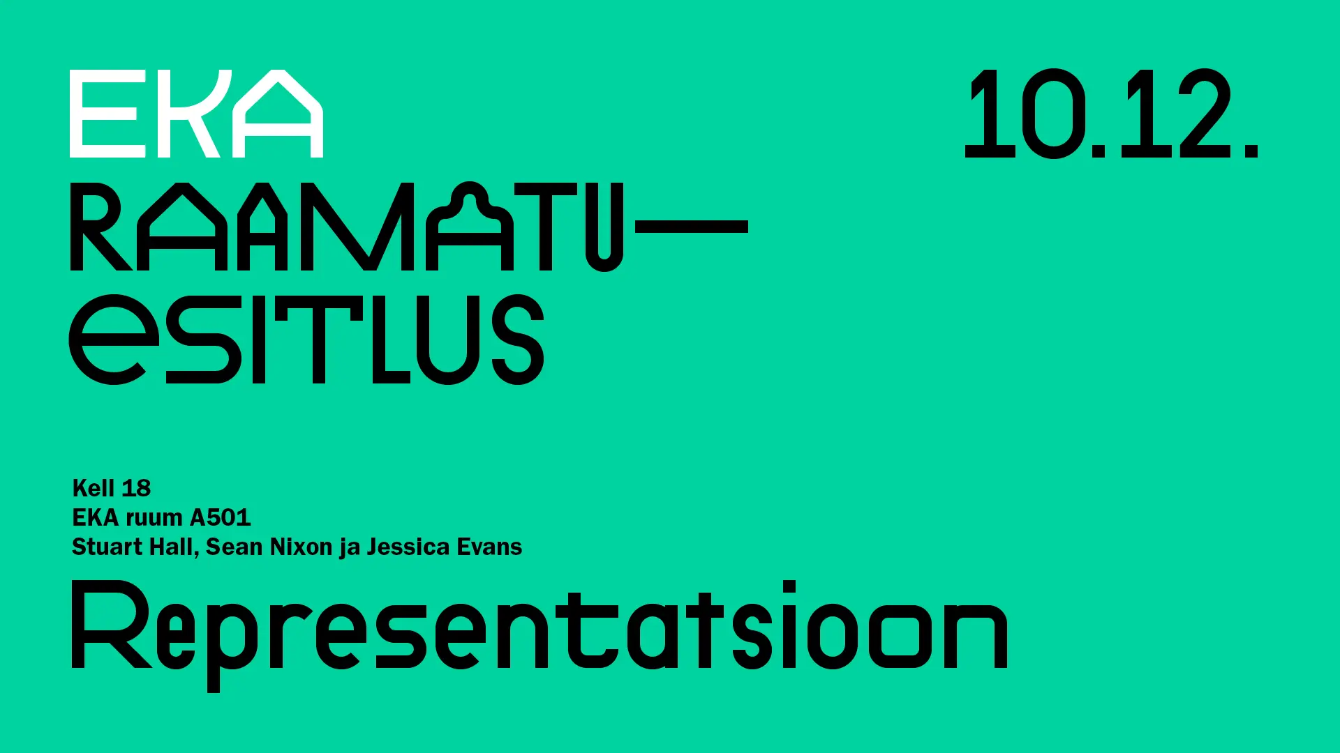
EKA’s visual communication is designed to be unified, professional, and easily recognizable. Following years without a permanent home, EKA embraced a new visual identity to foster unity. Inspired by the architecture of the Rauaniidi building and the diversity of EKA's disciplines, this identity balances consistency with flexibility, making it easier for audiences to recognize and engage with EKA's messages.
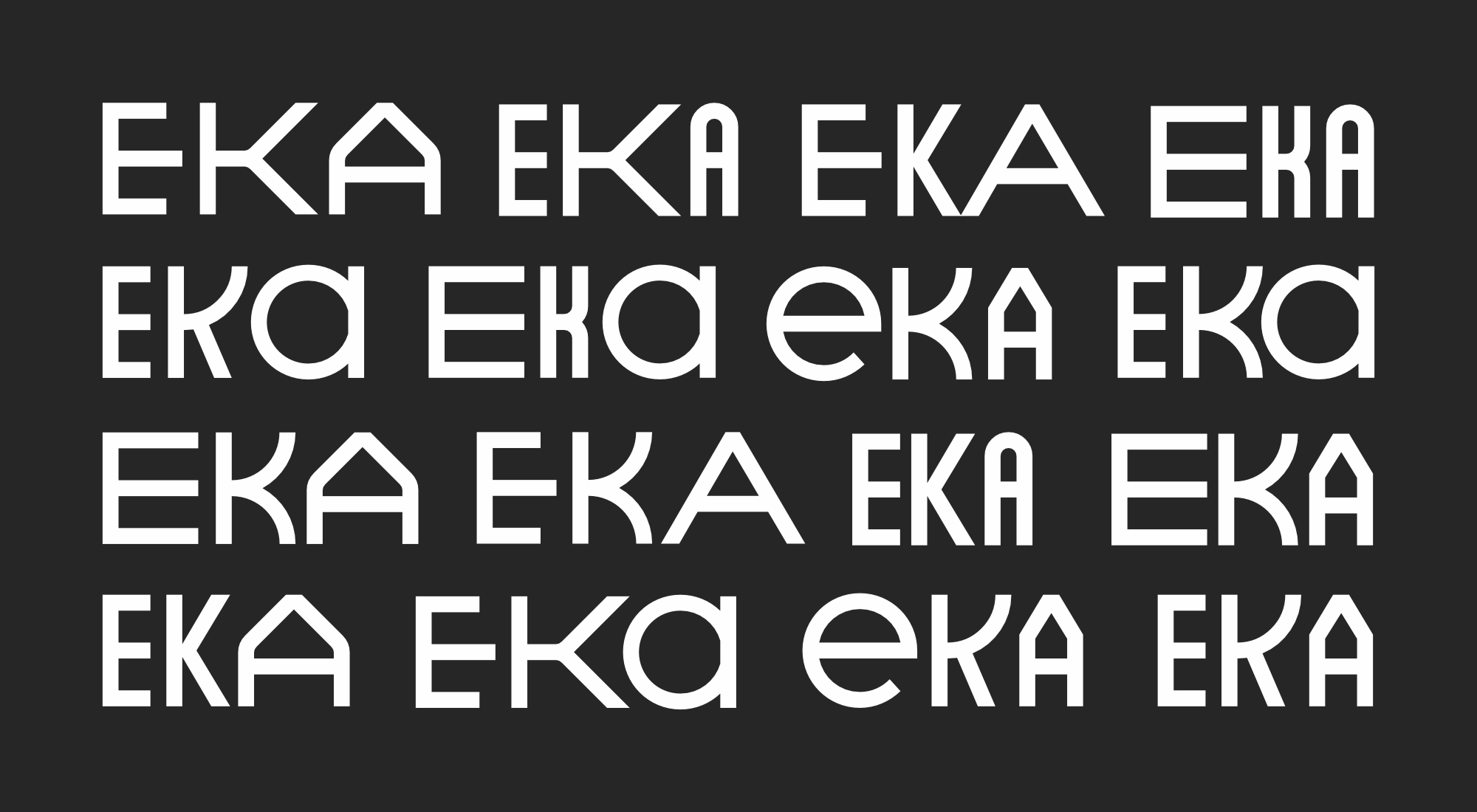
Working with Mathias Väärsi and in collaboration with Stuudio Stuudio, we developed the initial concept for EKA’s visual identity. We chose the "Absolution" font, designed by Niklas Ekholm of Helsinki Type Studio, and defined its application across various platforms. This laid the groundwork for a cohesive visual language, enhancing EKA’s brand recognition and communication efficiency.
Estonian Academy of Arts
The Estonian Academy of Arts (EKA)
wanted a visual identity that was simple,
professional, and easy to recognize.
After years without a permanent home,
EKA created a new identity
to bring unity to the school.
The design,
inspired by the Rauaniidi building
and EKA’s diverse programs,
balances consistency with flexibility.
We worked with Mathias Väärsi
and Stuudio Stuudio to develop the visual identity.
We selected the "Absolution" font by Niklas Ekholm
and defined how it would be used across different platforms.
This helped make EKA’s brand more recognizable and clear.